
A contemporary logo for an established financial services firm.
This is a sophisticated logo type for a boutique that features exclusive fashions for its discerning clients.
This client needed to undergo a complete and comprehensive rebranding campaign to reach a new audience with a more modern and competitive identity.
This simple logo was designed for a new online app to help event industry professionals calculate and purchase their commercial tenting needs.
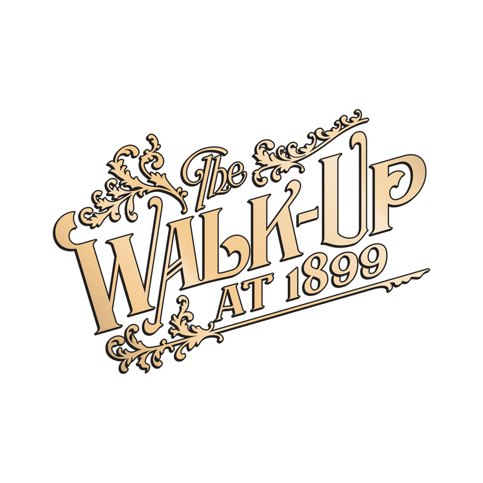
I'm a big fan of vintage signage and ephemera from the 1700s through the 1950s, so this project was a lot of fun. This is a logo design for a pub and entertainment venue with a turn-of-the-century (1899) vibe. I drew the letters and flourishes based on research of Rawson & Evans gilded window signs from that era.
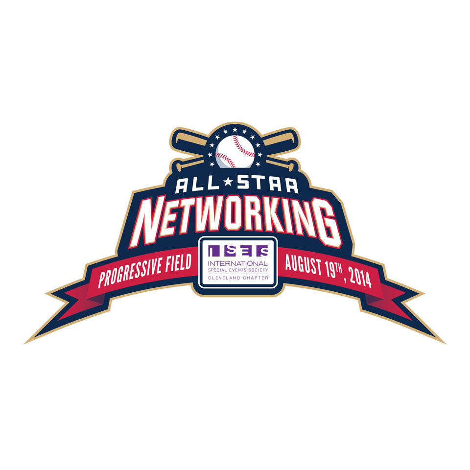
While I was employed at Event Source, I was also a member of the Cleveland chapter of ISES (International Society of Event Specialists). ISES held a networking event that was hosted by the Cleveland Indians at Progressive Field and I was asked to design a baseball-themed logo that would be used for signage, programs, and to be displayed on the Daktronics LED scoreboard screen.
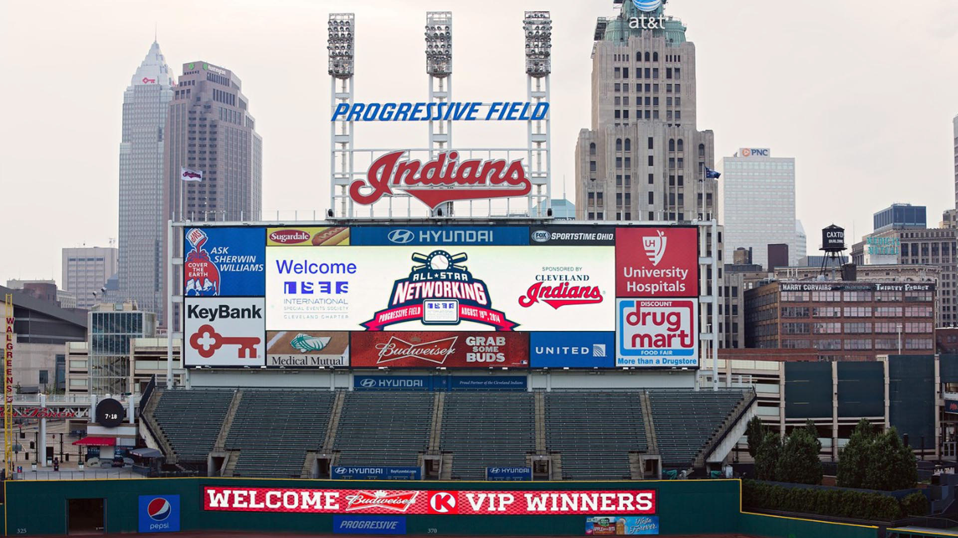
Here was the logo display slide that I submitted to The Cleveland Indians.
(Photo courtesy Dale McDonald)
(Photo courtesy Dale McDonald)
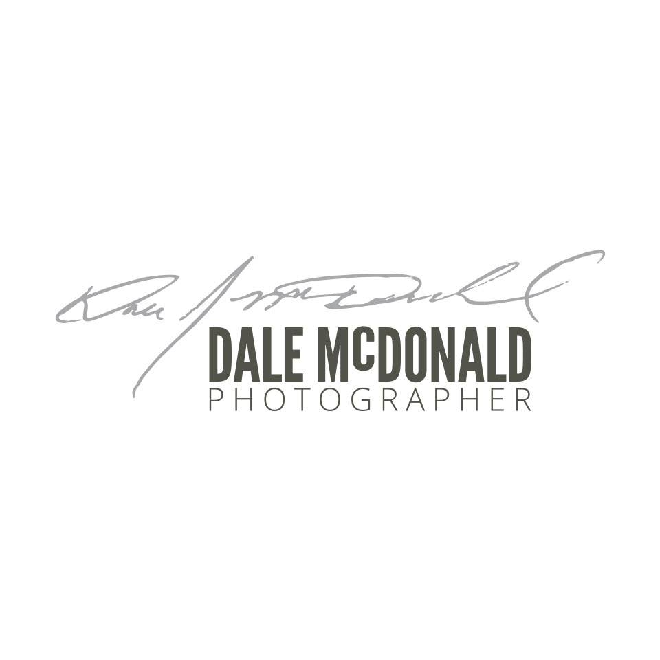
Dale is a good friend of mine and one of northeast Ohio's greatest photographers. I've worked with him on many occasions and his results are always stunning. I finally had an opportunity to help him improve his brand identity, including a new variation of his business name. I felt that as a fellow creative talent, he needed nothing more than to showcase his signature, so I asked him to sign a napkin while he was at dinner with his wife and text a picture of it to me. I hand-traced the signature in Illustrator and now his logo is very distinctive and memorable.

This is for an out-of-state veterinary hospital that wanted a simple, playful logo symbol that would stand out from their competition.
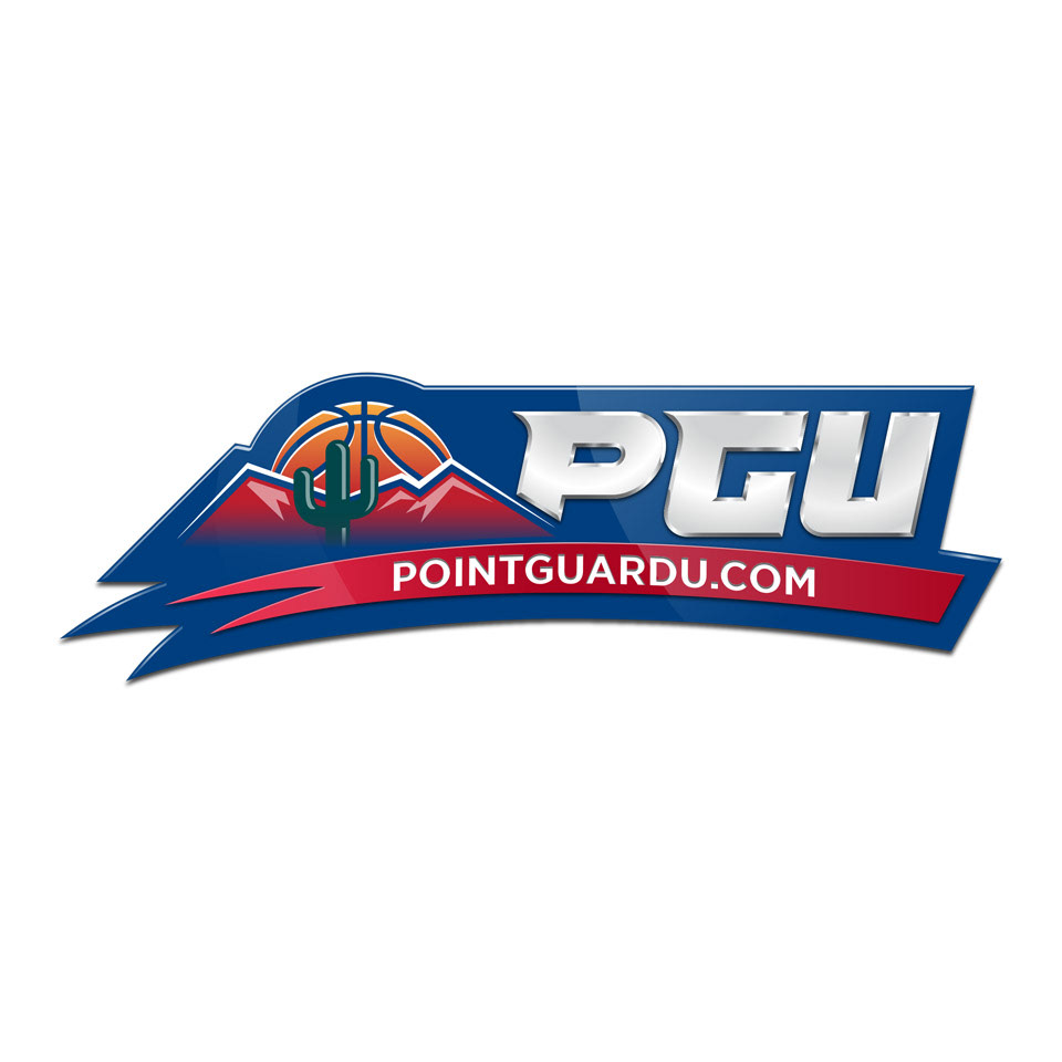
This is a logo project for a client who attended Arizona State University and started a fan website dedicated to covering the ASU basketball program. Obviously, the university carefully manages their brand identity and would aggressively protect against any potential risks of identity theft or infringement, so I had to tread lightly while designing this identity. The logo needed to say "Arizona State basketball", without directly saying "Arizona State basketball. I scrutinized the school's brand standards manual to determine that I did not indirectly use the same Pantone® colors or typography, yet it needed to be close enough so that fans would associate this brand with the team.
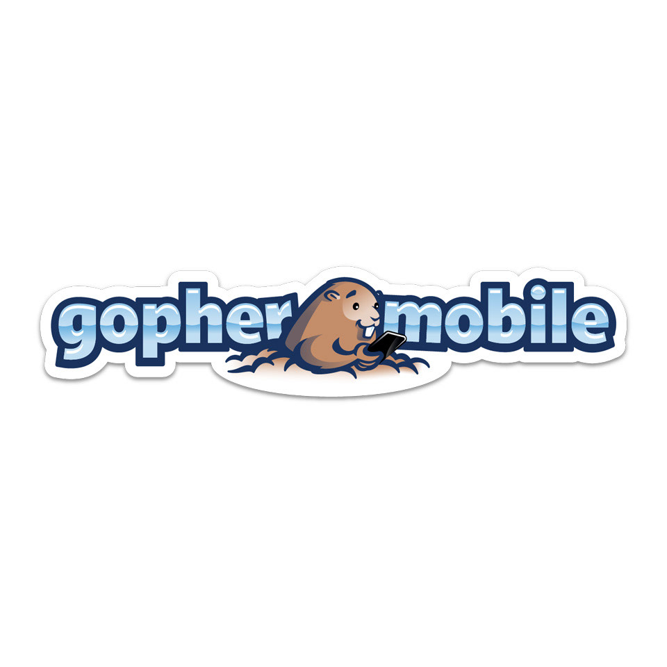
The client wanted to build an identity around a newly named mobile website development team. Their naming strategy was literally based on creating a set of animal names in small pieces of paper; one for each letter of the alphabet. They selected 'G', and so 'gopher mobile' was born. They wanted something playful that would exist primarily online.
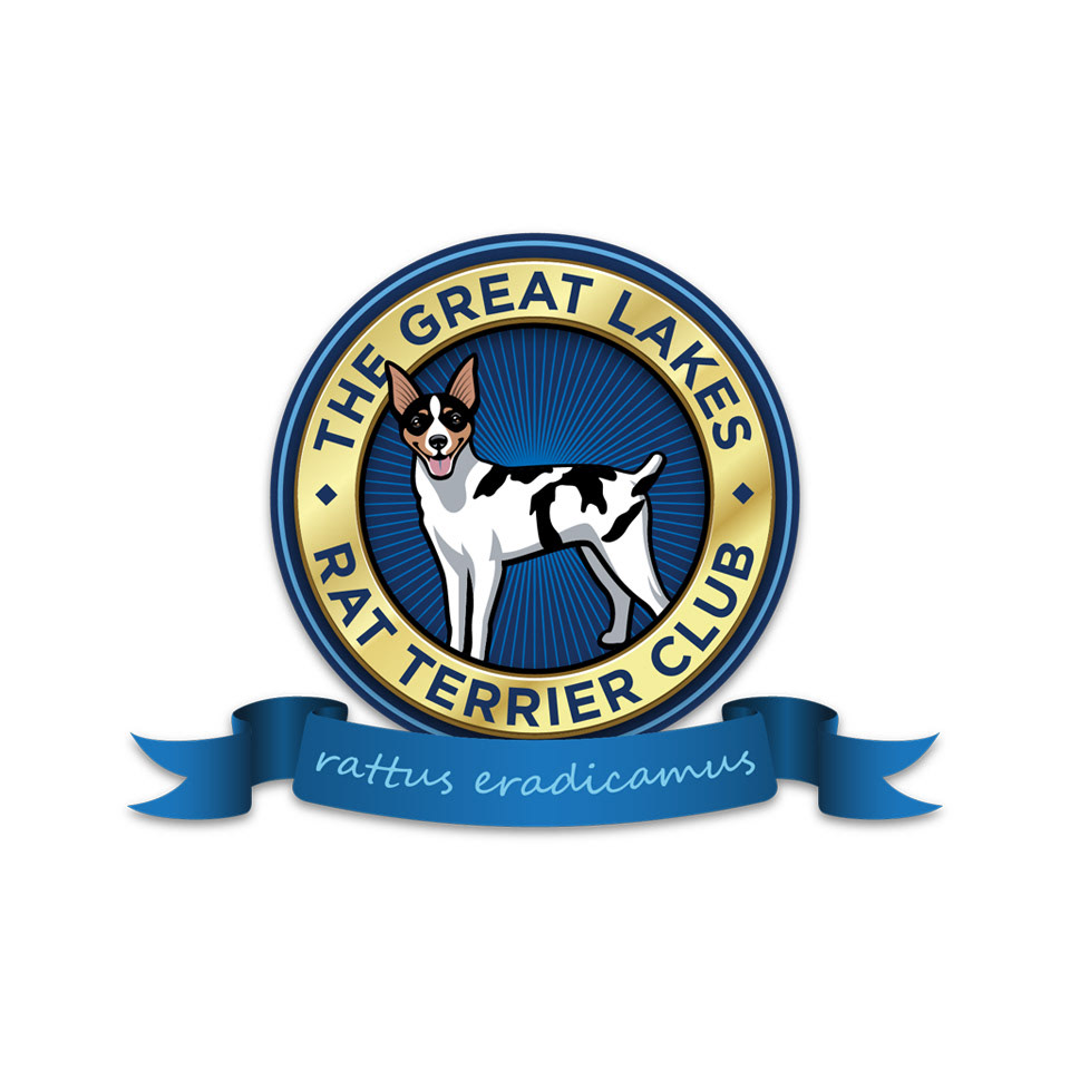
Another professional photographer and colleague with whom I've worked is also the pet parent of a lovable rat terrier. She knew that I had a rat terrier as well, so she came to me to create this emblematic logo for her breed enthusiast and agility club.
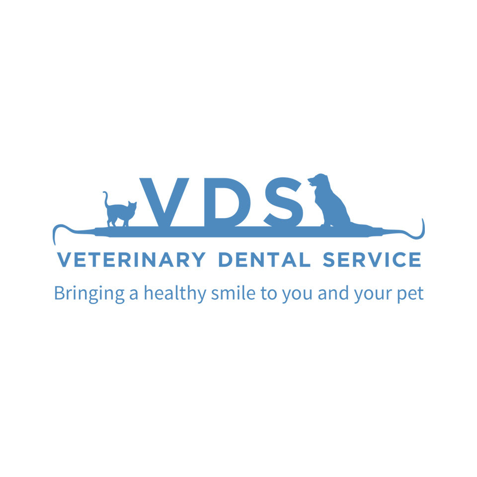
This client wanted a logomark that was attractive, but also obviously spelled out what they do to all audiences.
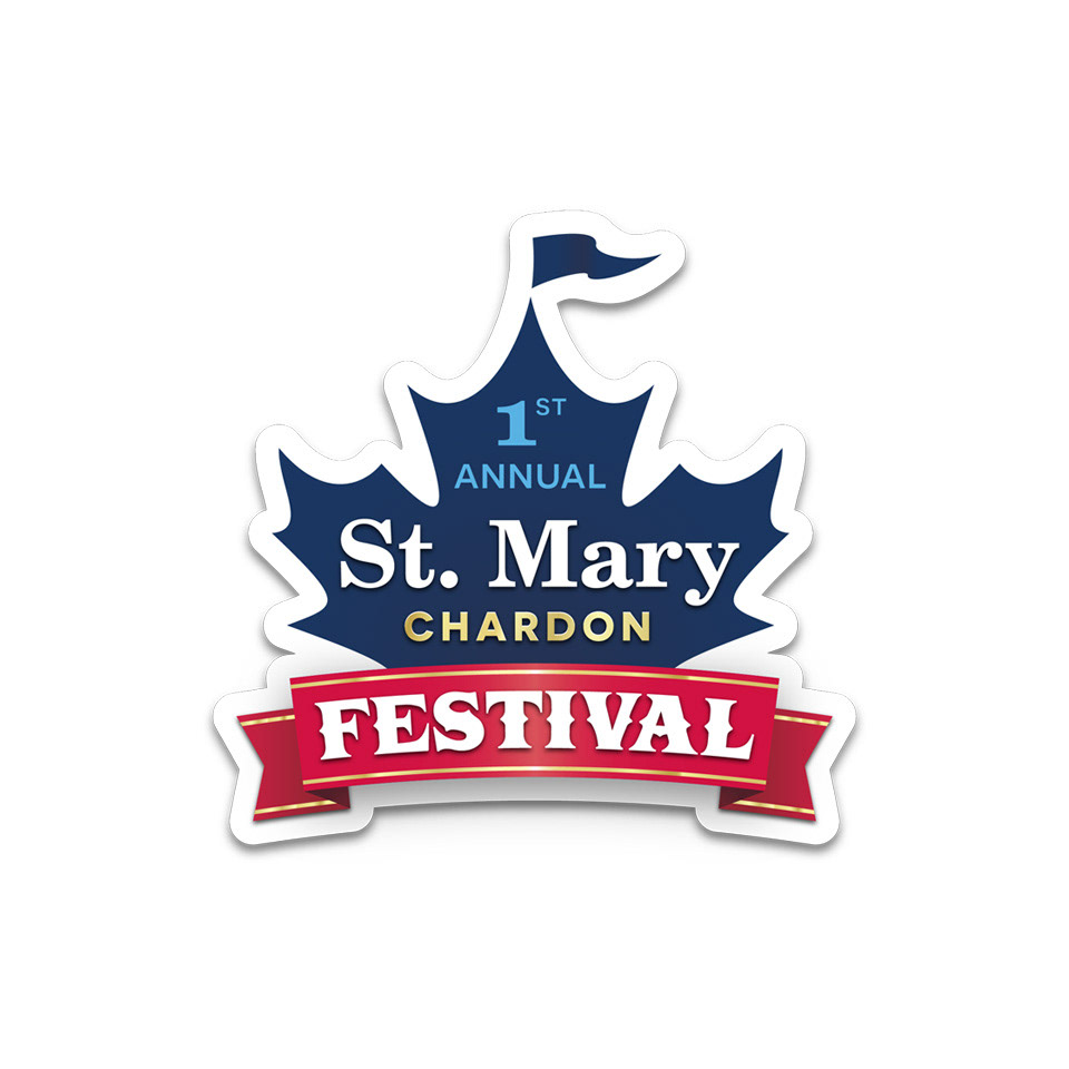
This was the debut mark for the St. Mary Parish Festival in Chardon. It needed to generate excitement for the festival and engage the hometown pride of Chardon, Ohio's maple industry capital.
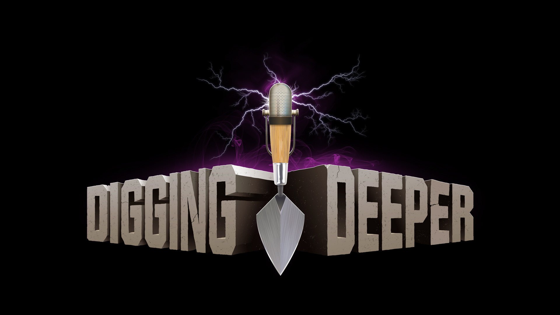
This logo is for a podcast. The brand's theme is archaeological mystery-related news and commentary. The logo needed to look dimensional and somewhat theatrical to speak to its audience. This project was a lot of fun and everything here was designed in Illustrator, except for the lightning and purple lighting effects. This was important because the logo may eventually need to be scaled to create printed fan merchandise.
This logo required an 'antiqued' look, like it was created by a Renaissance wood cut imprint.
Another logo symbol that needed a similarly vintage style.
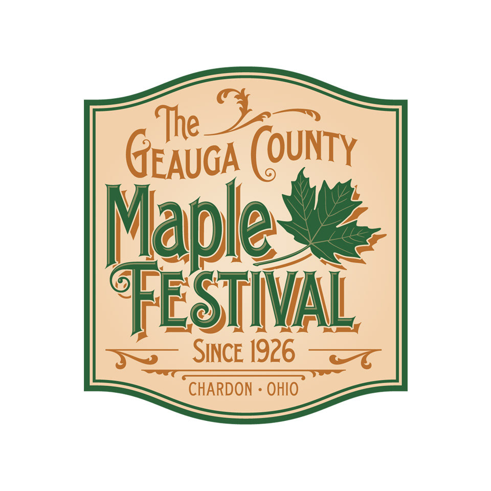
It was a great honor to have designed the official emblem of the Geauga County Maple Festival.

I went back to school a few years ago and this was a logo concept that was submitted to the college board for their consideration. The board ultimately abandoned the proposed program, which was in the planning stages to address public transportation issues that some students faced while attempting to attend urban campuses.
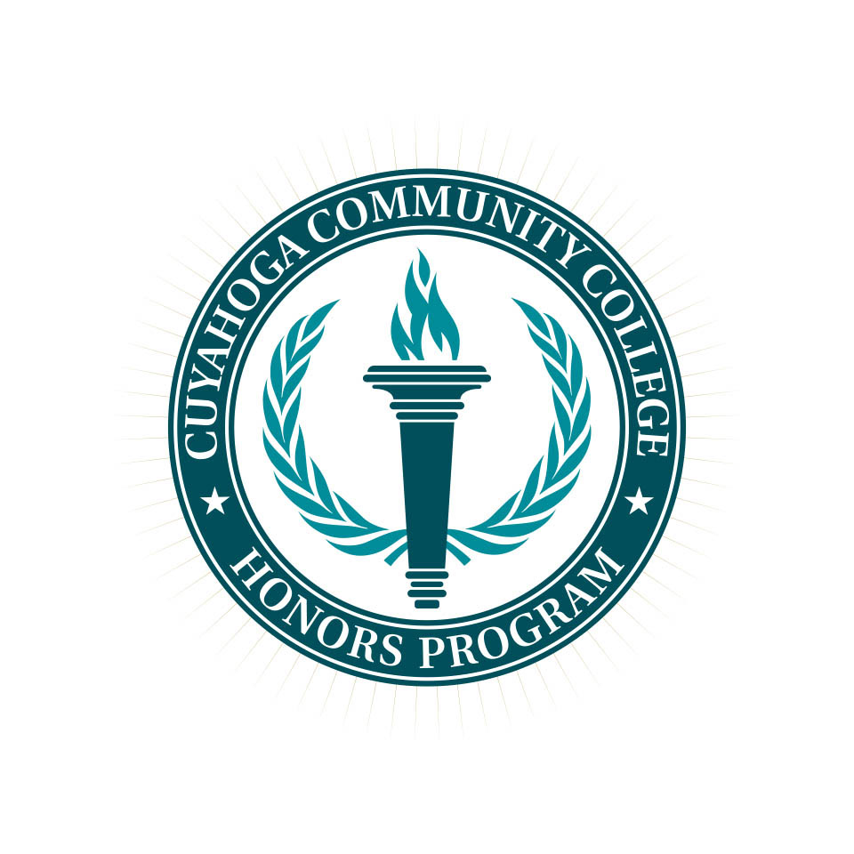
A new official emblem for the Cuyahoga Community College Honors Program.

Years ago I worked as a graphic designer who helped high schools and junior and community colleges across the country develop new identities for their athletic departments. This often meant modernizing and simplifying decades-old team mascots. That job was challenging because alumni and boosters are often reluctant to let go of their teams' old, familiar identities, but I really enjoyed facing those challenges.
This was a more recent example of a similar design challenge. While attending Cuyahoga Community College, there was a contest to redesign the school's athletic mascot. This was my submission.

An assistant to the athletic director asked me to create an update to the Kenston High School athletics identity.
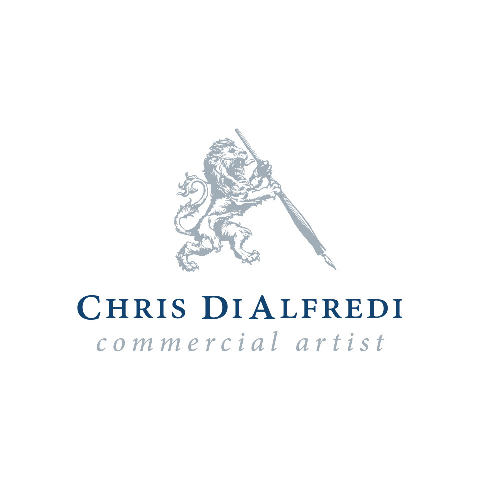
My old personal freelance design logo, which is my nod to my love of historic imagery. I drew the heraldic lion and pen on paper, then traced in Illustrator to create a precise vector image.