
I still illustrate with traditional media whenever the project or budget allows, but I've also been pushing pixels and vector paths since Photoshop 3 and Aldus Freehand. I love meeting the challenge of conveying complex ideas and concepts with custom images. The best design projects require me to adapt my style to meet the needs of the intended audience. I'm not limited by style or function. I can draw a simple cartoon character, a realistic face with fine art qualities, or scaled technical plans. Illustration is where I find my soul.
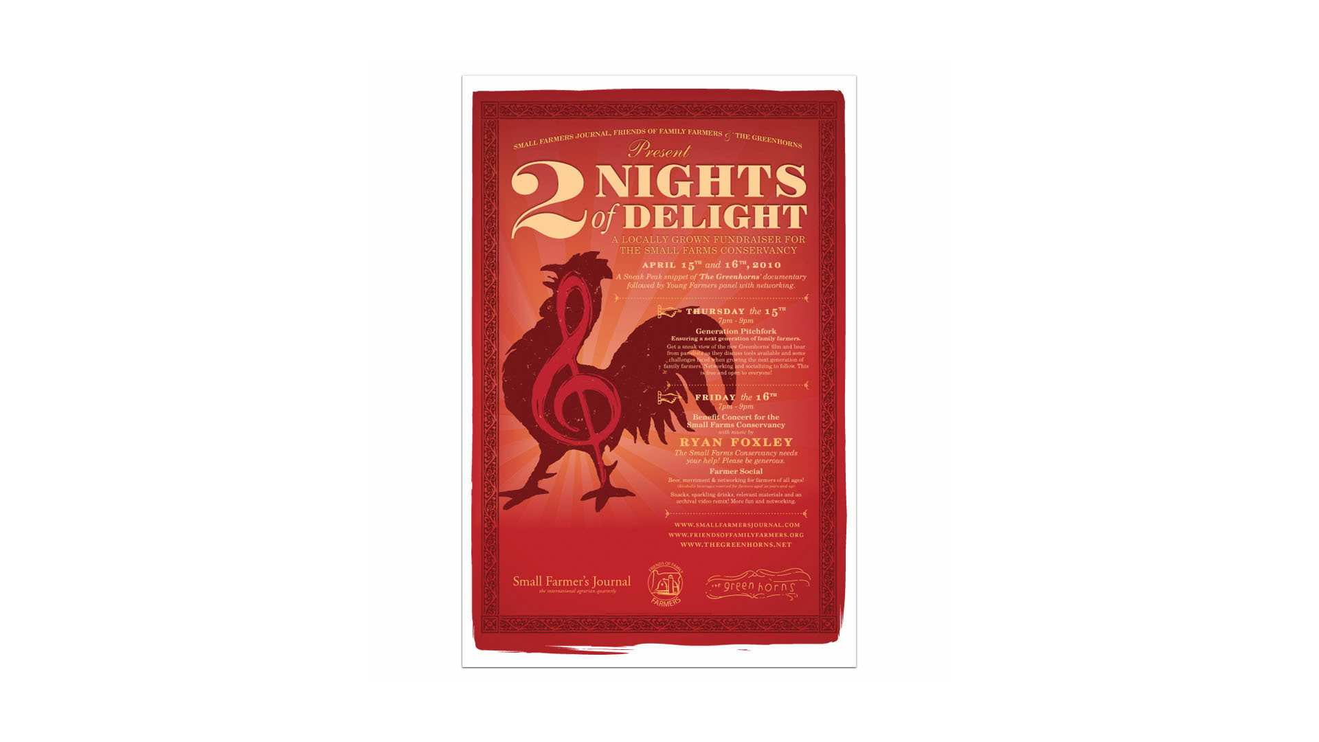
This was a poster that I designed for a promotional fund-raising event to benefit 'The Greenhorns', an independent documentary covering the recruitment of new, young farmers in America.

A local business owner asked me to create a custom Christmas card for his business. It needed to be, "..original and cute."

This is an illustrated logo design for an online gift shop that was going to feature local honey products. I drew the symbol (bunny chasing the bee) and logo type, then hand-vectorized everything in Illustrator. The style was influenced by Beatrix Potter illustrations.
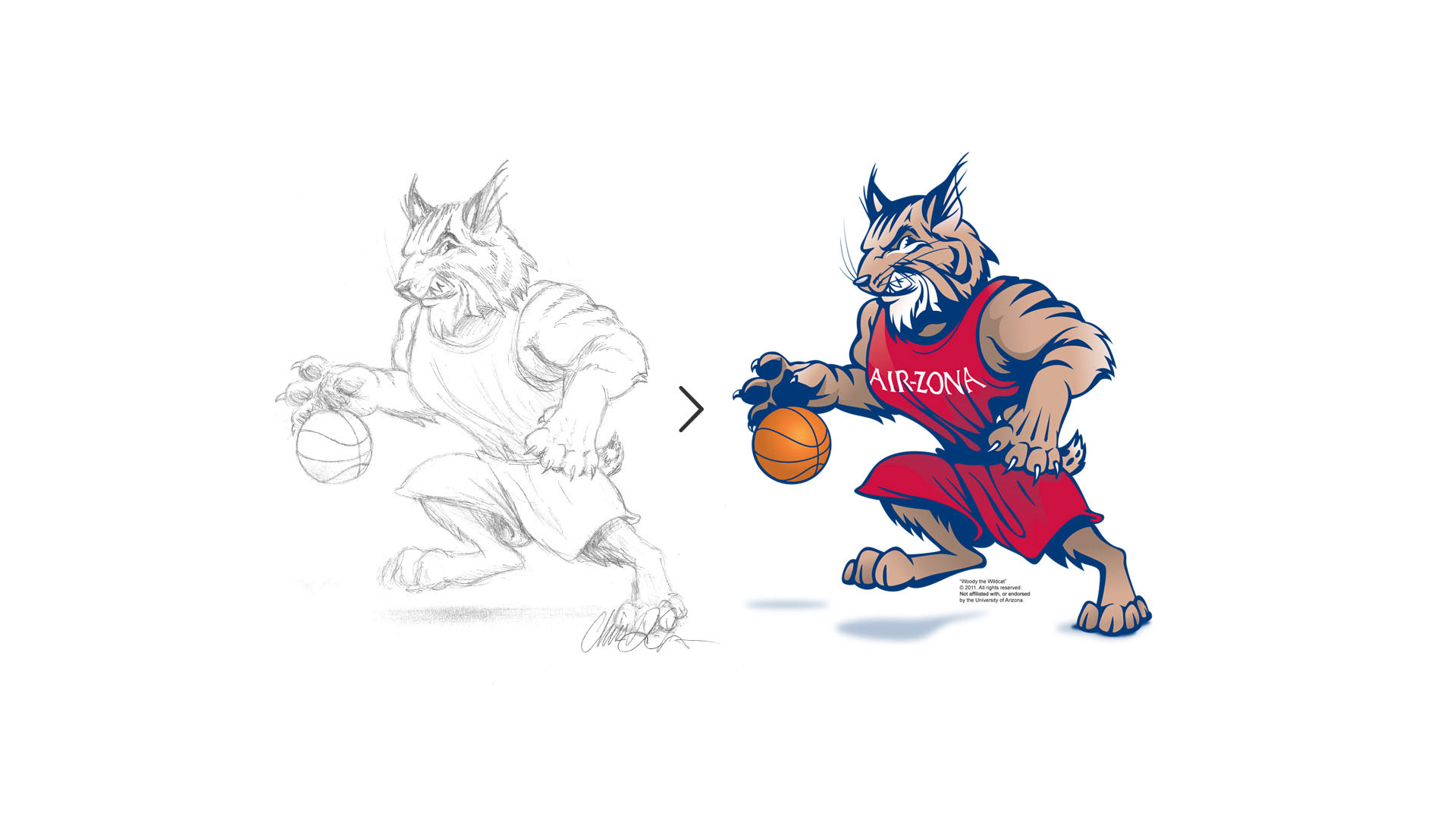
This is a custom mascot for PointGuard U., the fan website dedicated to covering Arizona State University basketball. My challenge was to create a wildcat mascot that rivaled the official Wilbur Wildcat, without infringing upon NCAA properties.

This was a medical illustration to demonstrate a typical veterinary dental technique to a general audience.
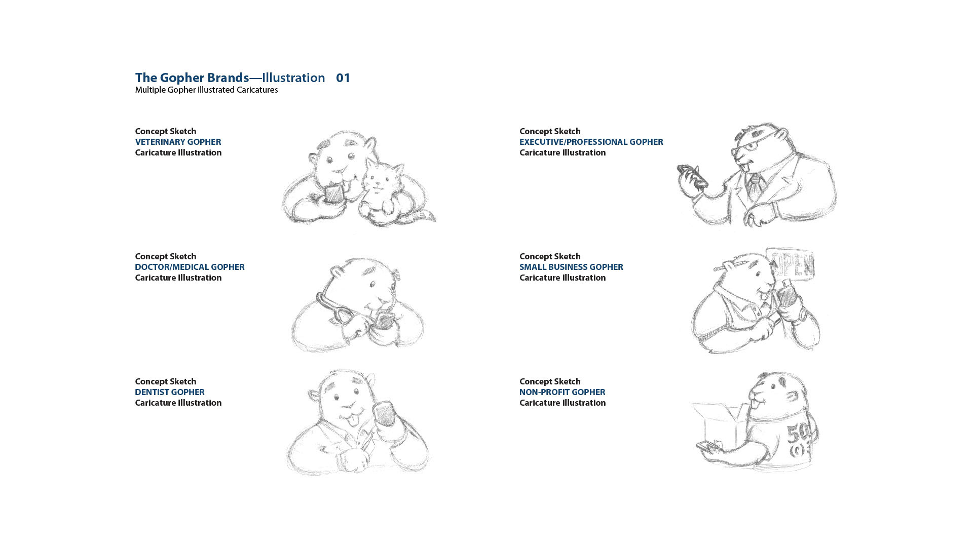
These caricatures were developed to support the Gopher brands, under the Gopher Mobile/Gopher Multimedia brand umbrella. The client asked me to design multiple instances of gophers that represented particular market segments, such as medical, small business, legal, etc.
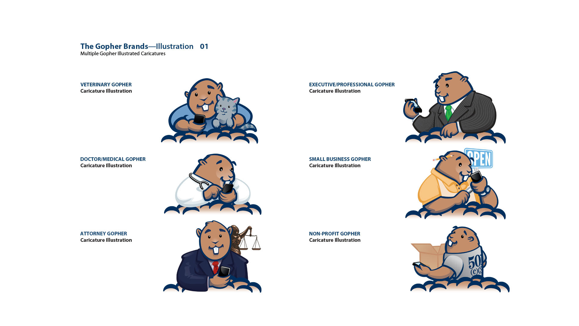
These are the completed, vector versions. All of the gopher caricatures were designed to use the same image of 'dirt', to represent that they're gophers, resting at the openings of their burrows.
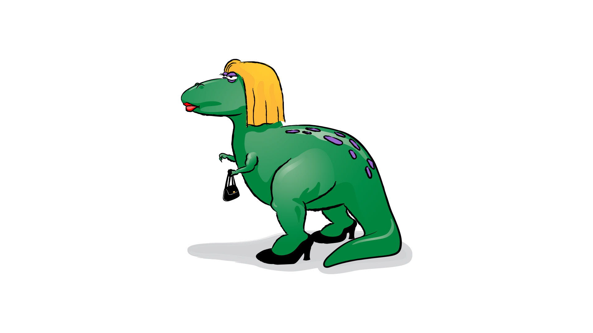
This female dinosaur image was an unpublished editorial cartoon.

The client wanted graphic elements to provide visitors to its large website with logical visual cues so that they would remember where they were. We agreed on colorful bars for the top of each page and I designed the bars, along with custom icons to reinforce the page titles.
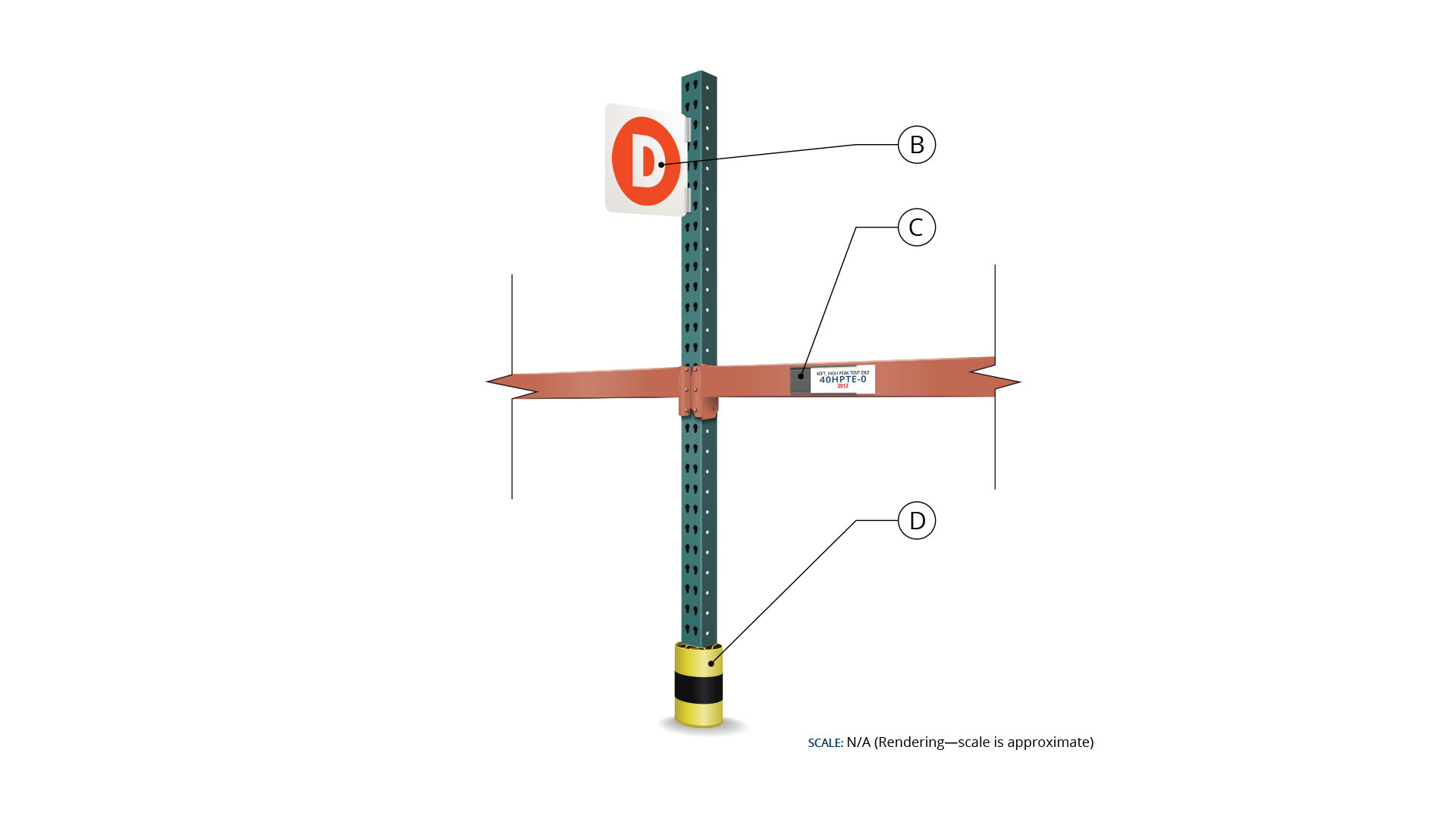
I had to illustrate a new comprehensive signage and organizational system for this client's warehouse. This illustration represents a typical section of industrial pallet racking (shelving).
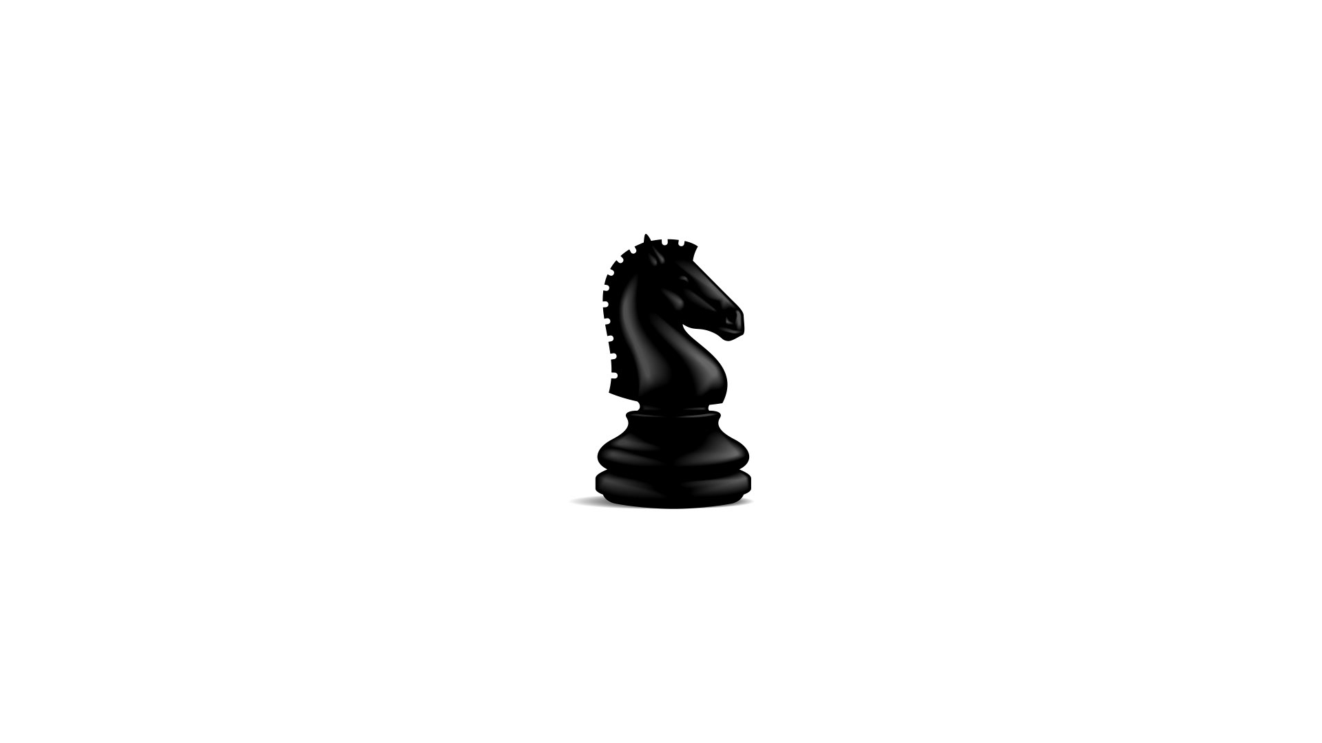
I designed this knight as the logo symbol for Eques, a brand design agency that I launched with my partner in 2015. I sketched it on paper, then redrew it in Illustrator.
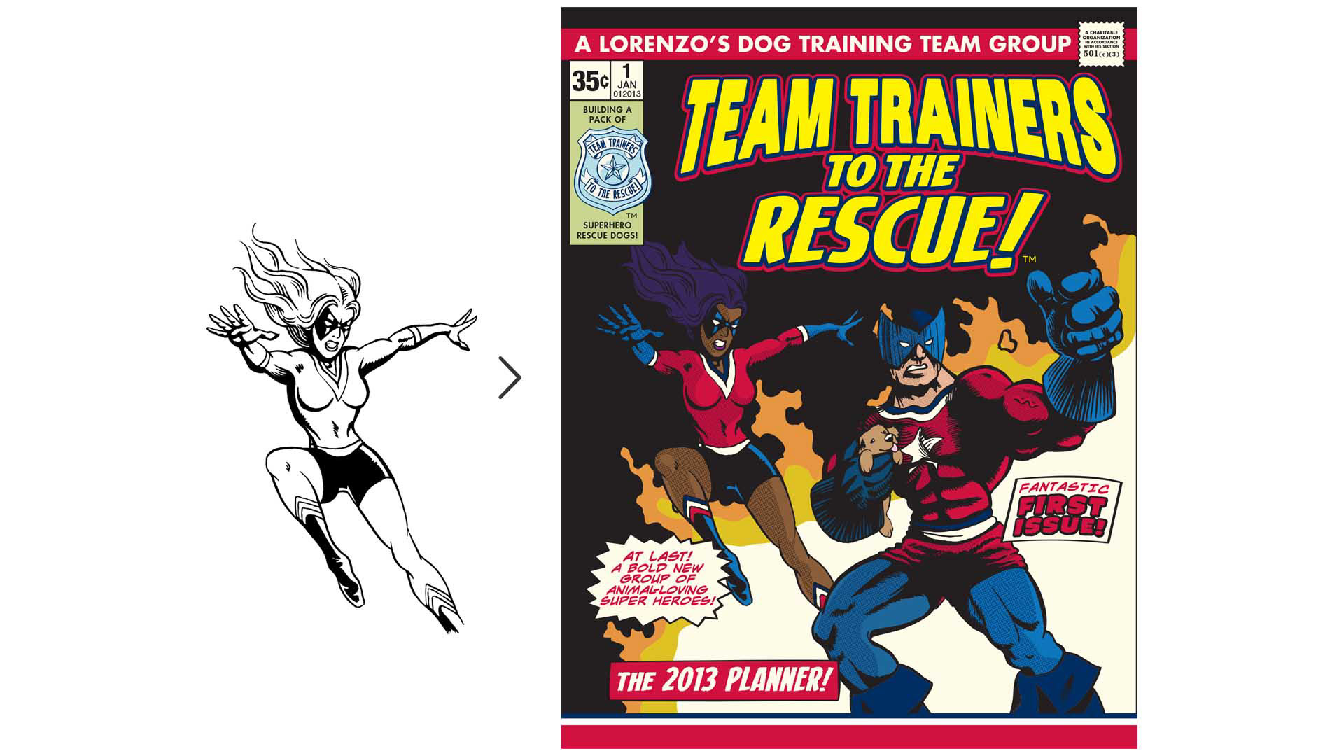
The client wanted to explore the idea of starting a 501 (c) (3) non-profit organization that would be related to his for-profit company. He was also a fan of 1970s comic books, so he wanted me to design a preliminary brand identity with a custom, vintage comic book theme that coordinated with the existing brand. I went to a local comic book store and purchased some old comic books for technical reference and style guidance.
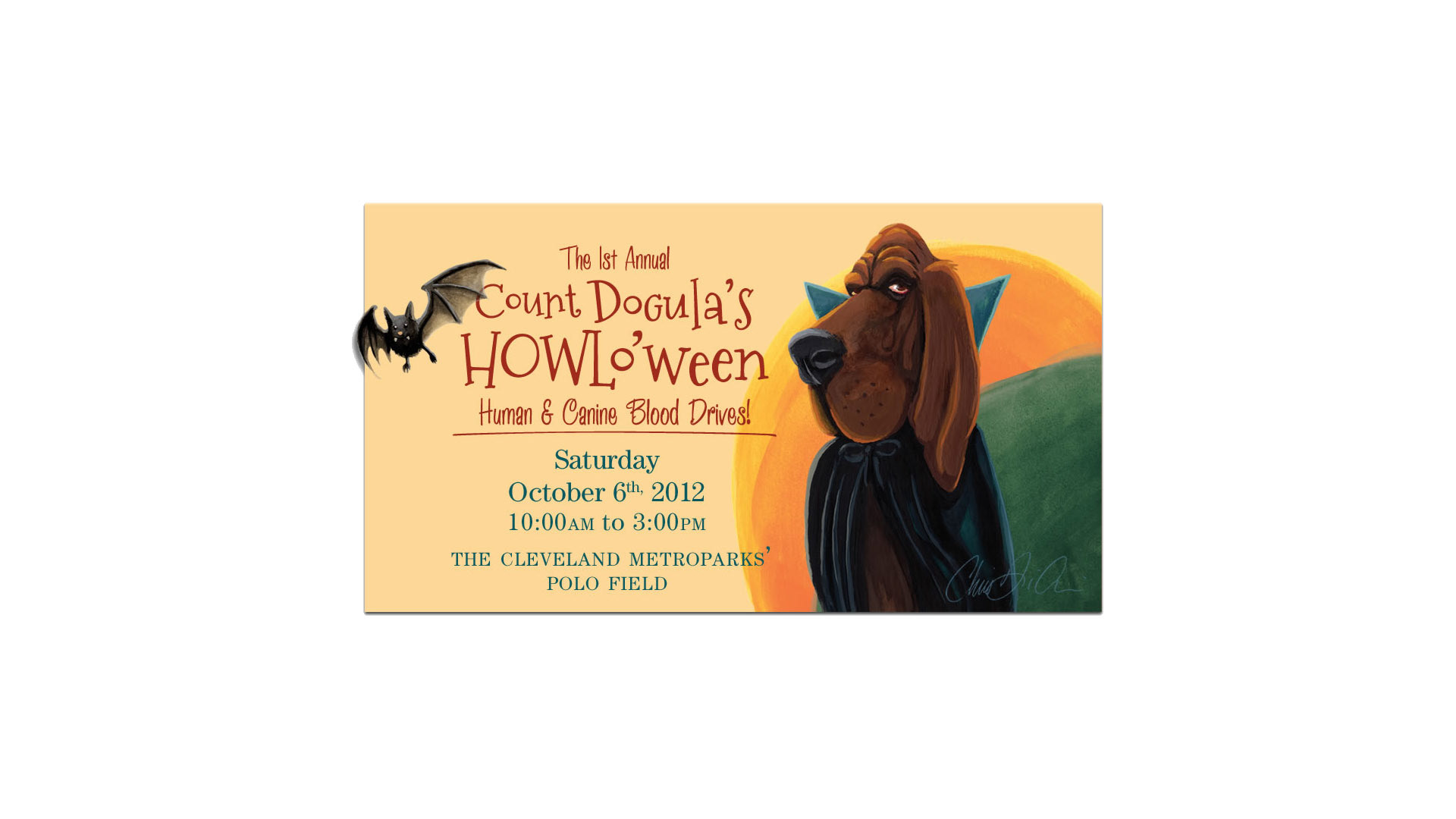
This image was part of the promotional look for a dog-related, Halloween-themed blood drive. I had time and creative freedom, so I opted to paint (gouache) the characters to give them a bit of a vintage feel.
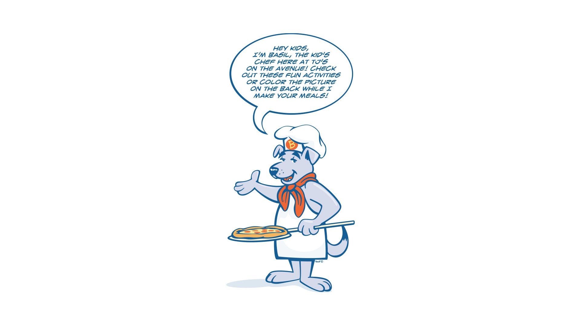
'Basil' is a character I designed for a local restaurant's kid's menu. I was inspired by 1960s Hanna-Barbara cartoons for this project, and I ended up with something that was kind of an Italian Huckleberry Hound. I imagined that he would sound like Tony Bennett when he talked.
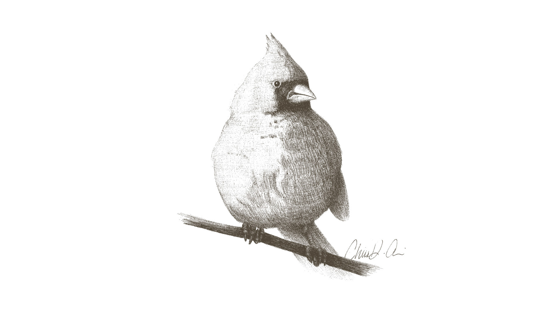
This is a simple pencil sketch study from a reference photo.
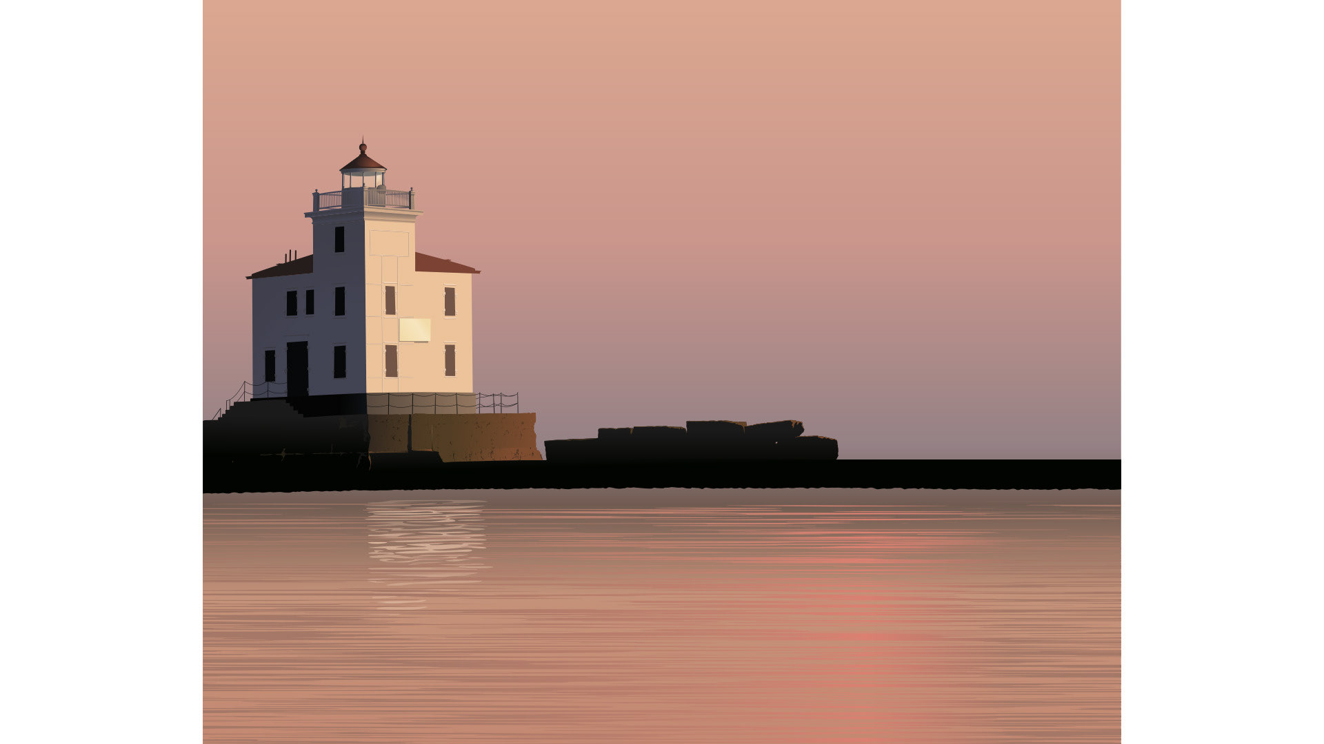
This was a promotional image for a client's Lake Erie-themed company. I designed this in Illustrator, working from the client's old, grainy photo that they had taken themselves while on their boat near the Fairport Harbor (OH) lighthouse.
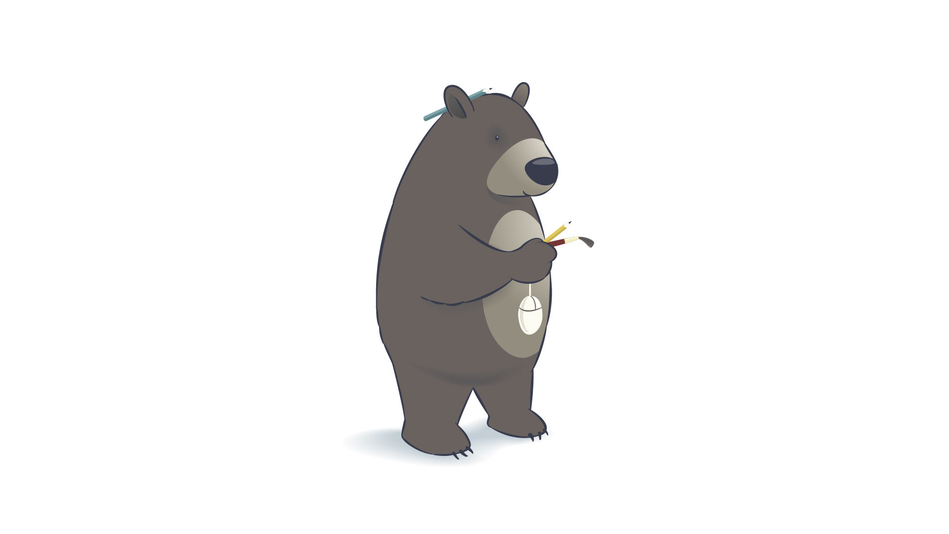
This is a stylized character that I sketched on paper, then completed in Illustrator. It was meant to represent me in a fun way.
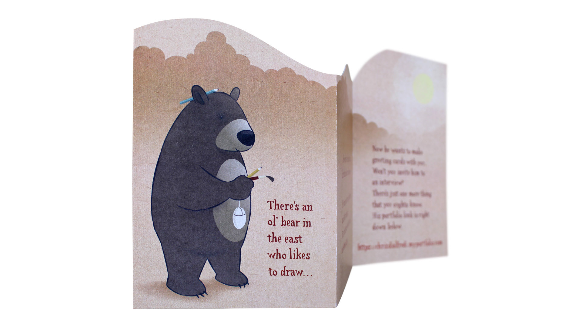
The character was used on a custom greeting card that I designed to impress a potential employer. I conceptualized the card, wrote the copy, designed every part of the card, including hand-lettering the type, and hand-trimming the card before mailing.
Special thanks to Jerry at PIP Printing in Mentor, OH! You made me look good.