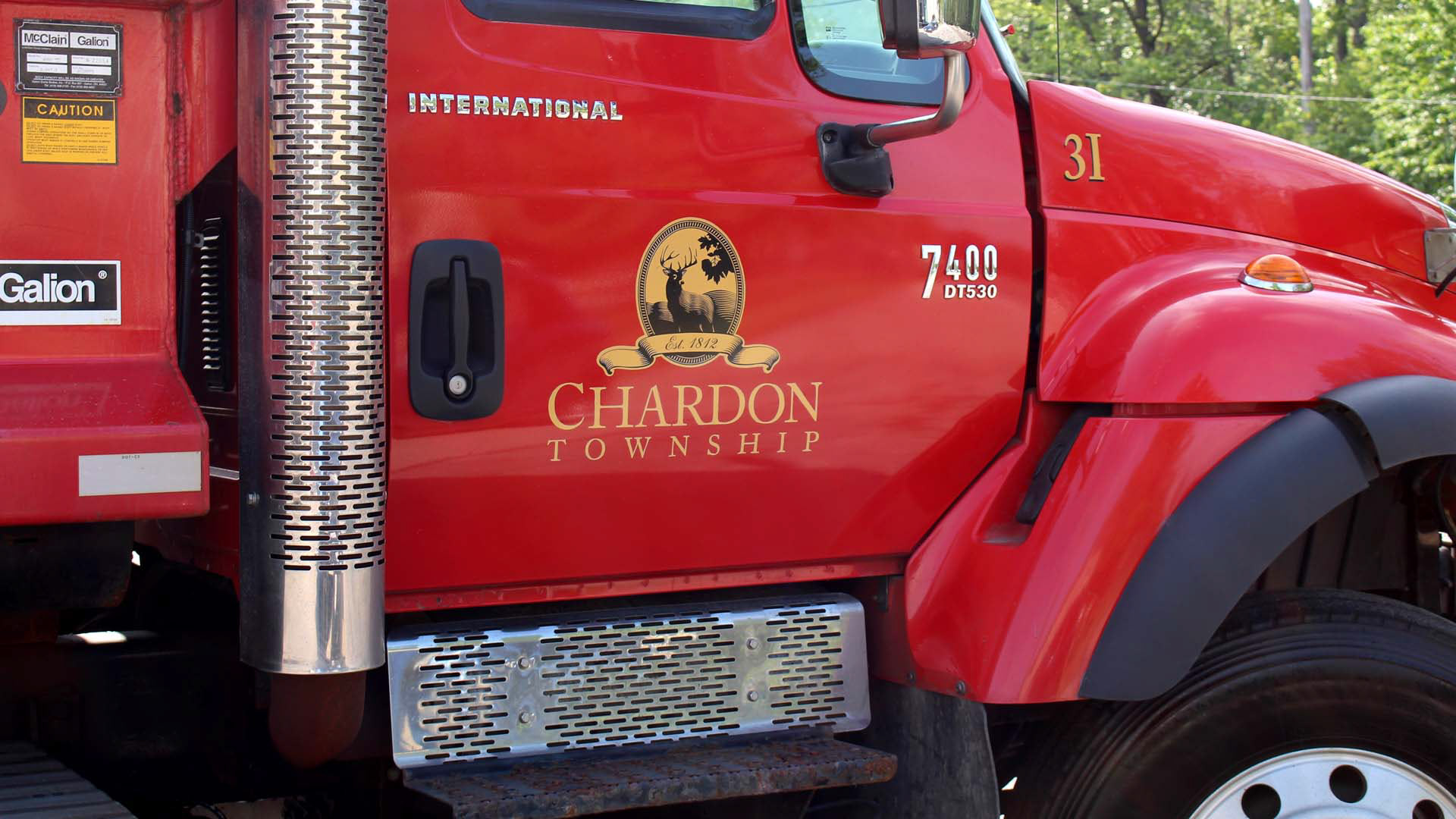
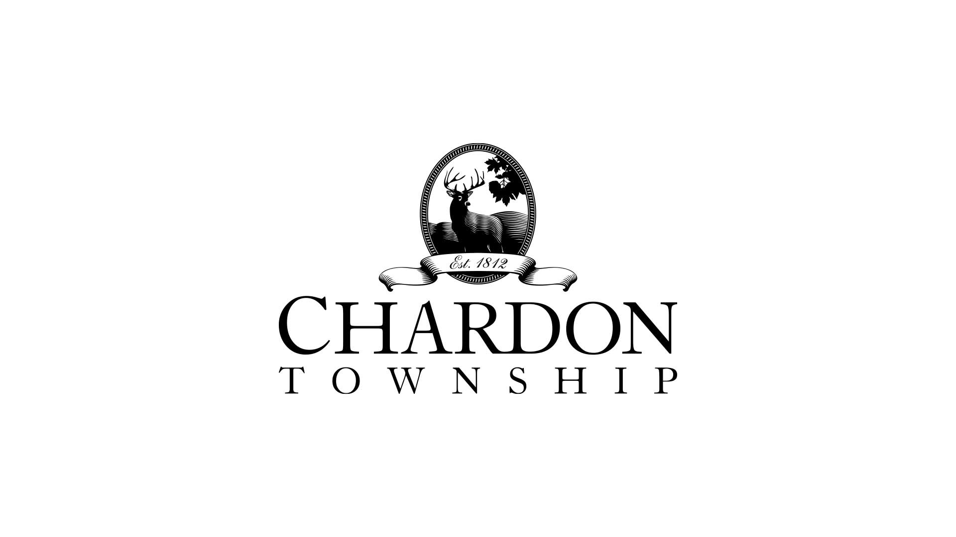
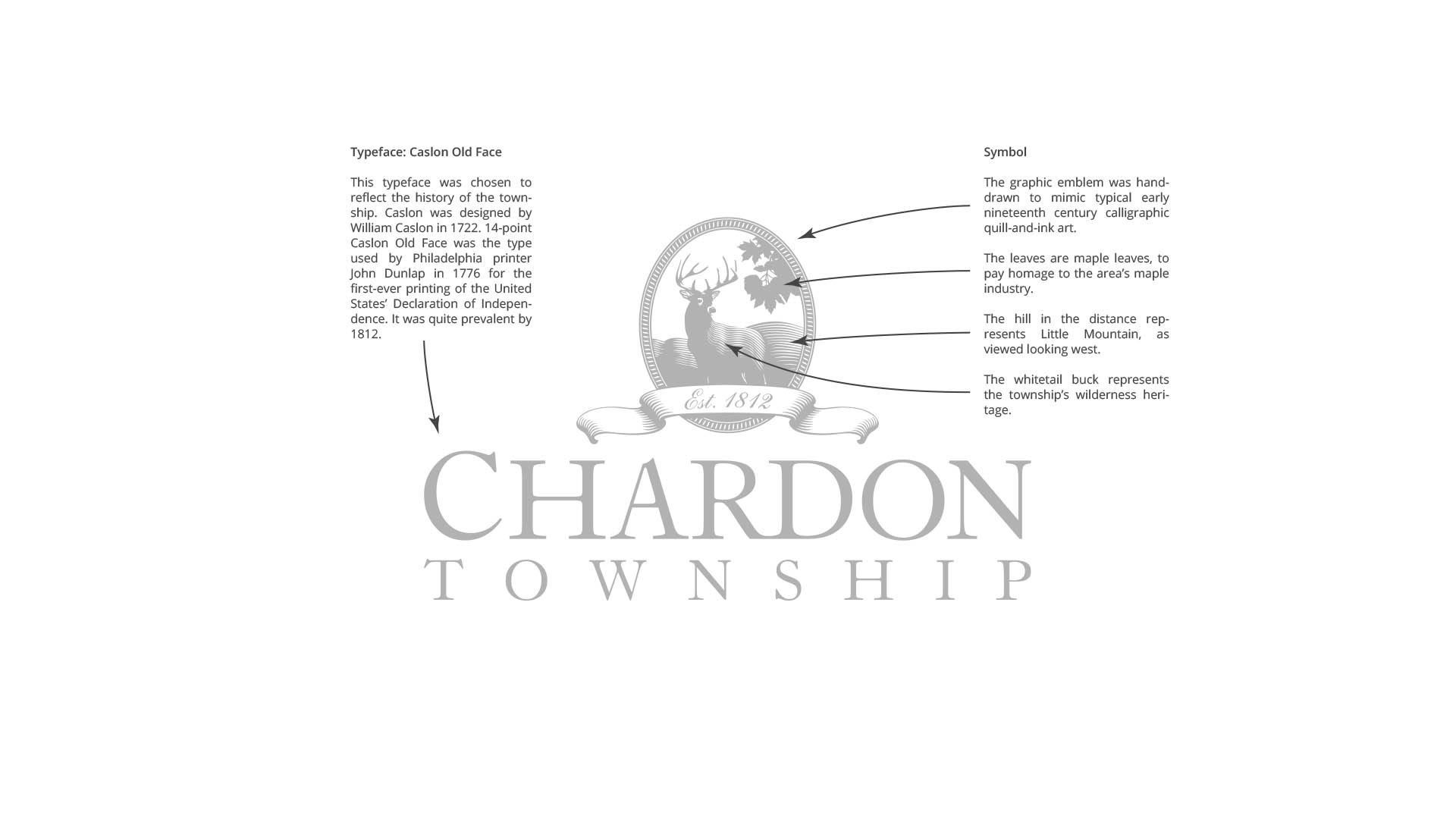
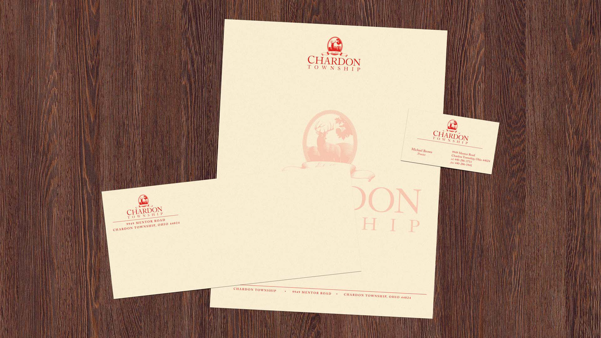
Chardon Township, Ohio issued an RFP from multiple design firms in 2006 for a comprehensive rebranding campaign that would culminate in a new, attractive identity for the township. Phases of the project would include a logo/emblem design, an official stationery system, a monument-style identity sign for the township hall, and vehicle graphics for the road department's fleet.
My proposal competed against proposals from six other designers/firms and was unanimously accepted at an official vote. I attended eight monthly township meetings in order to have each series of designs for different stages of the project approved.
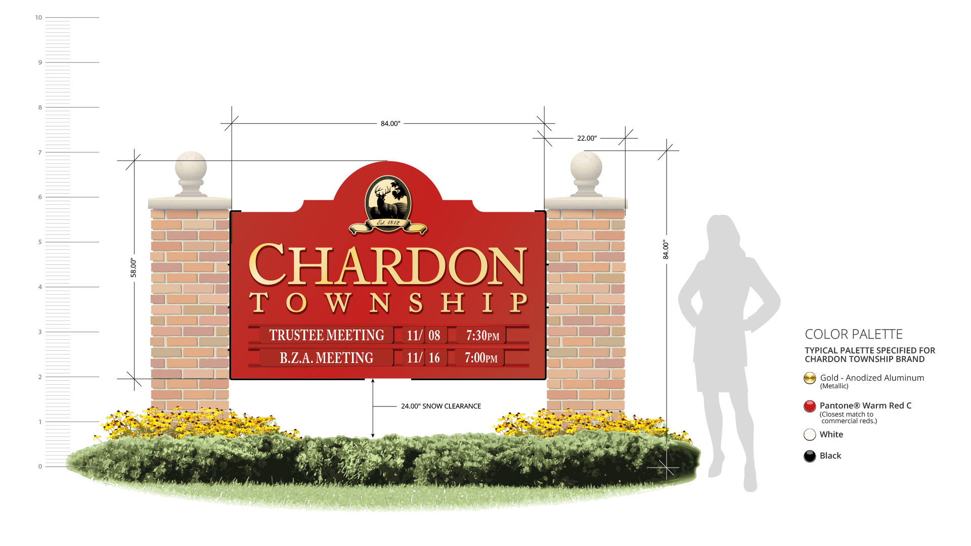

I designed every instance of this sign, as part of the overall brand identity project. I created all scaled technical drawings, submitted all drawings to the zoning commission for approval, produced all production art and specified all fabricated parts, and constructed the sign on-site after the brick mason poured the foundation and built the pillars.
*Note: The sign is now ten-years-old and showing signs of UV damage.
Special thanks to: Gemini, Ltd. (cast metal letters), Russo & Sons Aluminum (changeable message panels and tracks), Chardon Welding (custom mounting brackets), and Brick Block & Stone Masonry (foundation/pillars)